…But Is It Art?…
Choosing a hockey jersey design involves much more than deciding which colors look good together. A team jersey has to identify the club from across the rink, make player numbers easy to read, provide space for sponsors, work with the selected fabric and decoration method, and still look professional after a full season of use.
For youth hockey clubs in particular, the best designs also need some staying power. A jersey that looks current in 2027 should not feel badly outdated when the organization needs replacement jerseys or adds another team a year or two later.
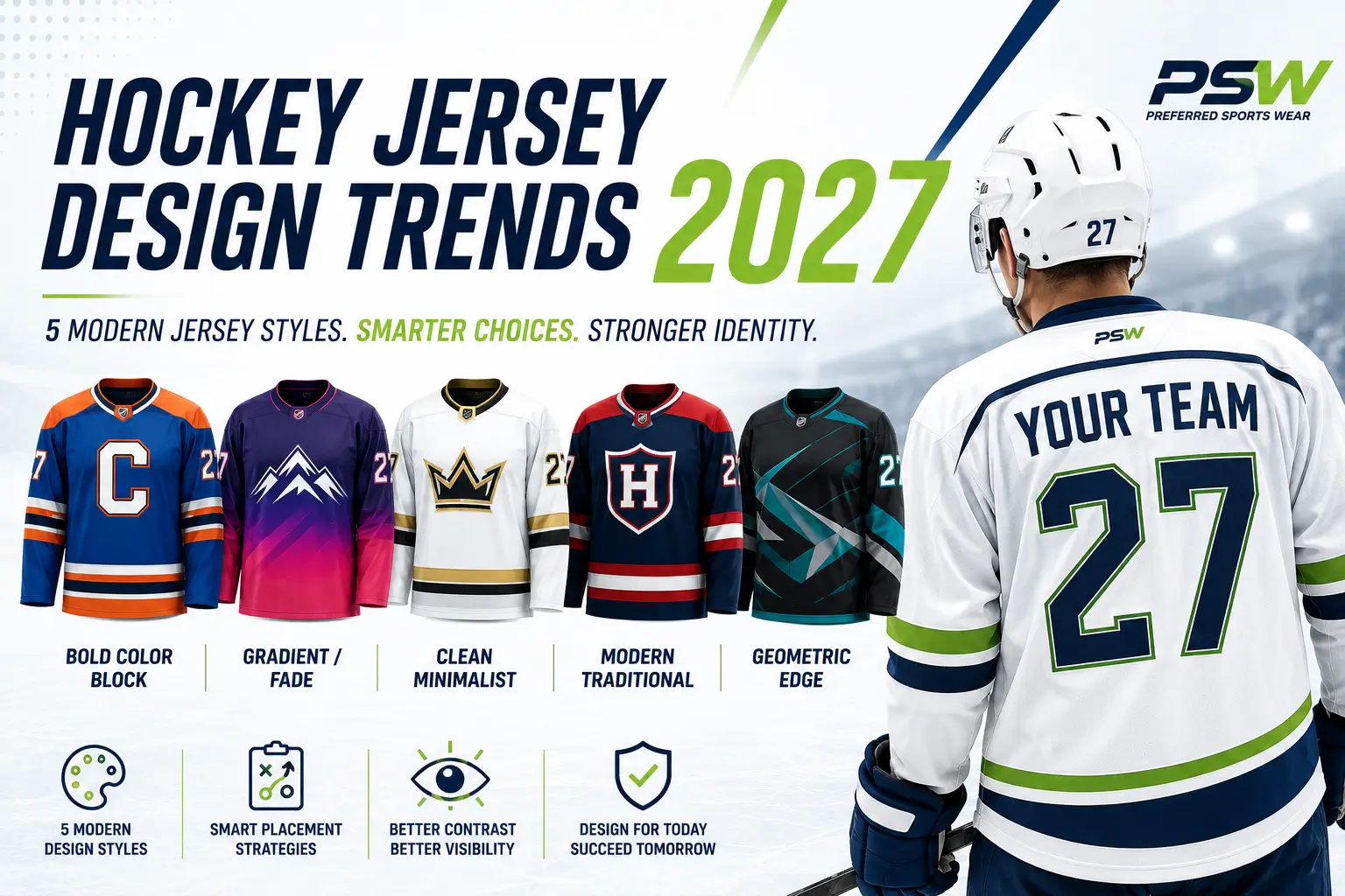
Several hockey jersey design trends are likely to remain prominent throughout 2027, including bold color blocking, controlled gradients, cleaner minimalist layouts, updated traditional striping, and selective geometric patterns. The objective is not to use every available design feature. It is to combine the right ones into a uniform that players, coaches, parents, sponsors, and the organization can continue using with confidence.
✔️ Key Takeaway
The strongest hockey jersey designs do not depend on using every available trend. Start with recognizable club colors, a clear crest, readable names and numbers, and enough contrast for the jersey to work on the ice. Then use color blocking, gradients, traditional striping, geometric patterns, or minimalist styling selectively to give the uniform its character without sacrificing team identity or future reorderability.
At a Glance
Bold Color Block
High-contrast shoulders, sleeves, panels and striping create immediate visual identity.
Gradient / Fade
Controlled fades add contemporary movement while keeping logos and numbers readable.
Clean Minimalist
Simple layouts make the crest, colors, names and numbers the strongest visual elements.
Modern Traditional
Classic hockey striping and shoulder treatments get cleaner proportions and fresher contrast.
Geometric Edge
Tonal angles and controlled patterns add motion without overpowering the team identity.
2027 Hockey Jersey Inspiration
Five Design Directions Worth Watching
These are not rigid templates. They are visual directions teams can adapt to their own colors, identity, sponsor needs and budget.
Bold Color Block
High impact. Modern edge.
- Best for
- Teams with 2–3 strong club colors.
- Visual character
- Fast, energetic and highly recognizable.
- Watch out for
- Too many competing color zones.
Gradient / Fade
Contemporary flow.
- Best for
- Teams wanting a modern, fresh look.
- Visual character
- Smooth, dynamic and distinctive.
- Watch out for
- Busy backgrounds behind names and numbers.
Clean Minimalist
Simple. Iconic. Timeless.
- Best for
- Clubs with a strong crest and established identity.
- Visual character
- Clean, confident and professional.
- Watch out for
- Going so minimal that the jersey loses personality.
Modern Traditional
Classic feel. Fresh look.
- Best for
- Established clubs that value tradition.
- Visual character
- Familiar structure with updated proportions.
- Watch out for
- Over-styling away the classic identity.
Geometric Edge
Dynamic motion.
- Best for
- Teams wanting a distinctive modern look.
- Visual character
- Movement, energy and edge.
- Watch out for
- Patterns that compete with the crest or numbers.
Why Hockey Jersey Design Matters
Good hockey jersey design gives a team a consistent visual identity. Players should be recognizable as part of the same organization whether they are on the ice, sitting on the bench, attending a tournament, or appearing in team photographs.
Consistency becomes even more important for clubs operating several age divisions. A youth organization may have multiple teams wearing different jersey sizes and cuts, but its primary colors, crest, number style, and general design language can remain consistent throughout the club.
Well-planned custom hockey uniforms can also make future ordering easier. When a club establishes a repeatable design rather than changing its jersey dramatically every season, replacement players and new teams can be added without requiring an entirely new visual identity.
What to Keep in Mind
A hockey jersey has several jobs at once. It needs to identify the team, make players easy to recognize, accommodate required markings and sponsors, and create a design that the organization can reproduce in future seasons.
Bold Color Blocking Continues to Grow
Color blocking is one of the easiest ways to create modern hockey jersey color combinations while keeping a uniform easy to recognize. Instead of covering the entire jersey with detailed graphics, designers divide the garment into larger areas of color.
A team might use its primary color through the body of the jersey while placing a secondary color across the shoulders. Contrasting sleeves, cuffs, side panels, collars, or lower-body striping can then introduce additional color without overwhelming the design.
Design Tip
Try viewing the jersey from a distance before approving the design. If the main color blocks, crest, and player number remain easy to distinguish when the jersey is reduced to a small image, the layout will usually translate better to the rink.
Modern Gradient and Fade Designs
Gradient hockey jerseys allow one color to gradually transition into another rather than changing at a hard line. The effect can run vertically, horizontally, diagonally, or through selected areas of the jersey.
Gradients are particularly suited to sublimated jerseys because the color transition can be incorporated directly into the printed design. Teams may use a dark-to-light version of the same club color or blend two compatible colors together.
The danger is trying to do too much. Gradients combined with oversized patterns, multiple sponsor logos, detailed backgrounds, contrasting stripes, and several accent colors can quickly make a jersey difficult to read.
Clean, Minimalist Hockey Jerseys
Not every modern design needs more graphics. In fact, some of the most effective simple hockey jersey designs use large areas of solid color, one recognizable crest, clearly defined striping, and highly readable numbers.
A minimalist approach puts greater emphasis on the elements that actually identify the team. Instead of competing with a complicated background, the club logo becomes the main focal point.
Key Takeaway
A jersey does not have to look complicated to look custom. A strong crest, recognizable club colors, clear numbers, and one or two distinctive design elements are often enough to create an effective team identity.
Traditional Hockey Styling Gets a Modern Update
Traditional hockey striping remains useful because it gives the jersey structure. For 2027, the more modern versions tend to simplify those classic elements rather than eliminate them. Teams can retain shoulder yokes, sleeve bands and lower-body stripes while adjusting proportions, spacing and accent colors.
This approach is particularly useful for established clubs that want a fresher jersey without abandoning a visual identity players and families already recognize.
Geometric Patterns Add Movement
Geometric and angular patterns can give sublimated jerseys a stronger sense of motion. They work best when the pattern is treated as a supporting element rather than the main identity.
Tonal patterns, partial sleeve graphics and controlled side-panel shapes are generally easier to live with than full-coverage designs that compete with the crest and numbers.
Classic vs. 2027 Modern
The same team identity can feel very different depending on how the colors and striping are handled.
Classic
Traditional striping, familiar balance and a more conservative layout.
2027 Modern
Cleaner lines, stronger blocks and more deliberate use of contrast.
Good Contrast vs. Bad Contrast
Readability matters more than a clever color combination.
Performance Fabrics Influence Design Choices
The material and decoration method selected for custom hockey uniforms can affect which designs are practical.
Sublimation gives teams considerable design freedom because colors, patterns, names, numbers, and many graphic elements can be incorporated into the printed fabric. This makes gradients, geometric patterns, tonal graphics, and other detailed effects easier to reproduce than they would be using individually applied decorations.
Teams should therefore avoid choosing jersey artwork in isolation. The design, fabric construction, fit, and decoration method need to work together.
Our Hockey Uniform Glossary can help team managers understand common uniform, fabric, and decoration terminology before discussing these options with a supplier.
Popular Number, Name and Logo Placement Trends
Creative graphics may attract attention, but hockey jersey numbers still have a job to do. They should be large enough, clear enough, and contrasting enough to identify players during a game.
Jersey Placement Map
- Front crest
- Shoulder mark
- Captain or alternate letter
- Sleeve number
- Player name
- Back number
- Sponsor zone where permitted
League and association requirements should always be checked before final approval.
Before You Approve the Proof
Confirm number readability, player name placement, captain letters, team crest positioning, sponsor locations, and any league-required markings. It is much easier to correct these details during proofing than after the jerseys have been produced.
Choosing Colors That Represent Your Club
The best hockey jersey color combinations usually begin with the organization’s established identity rather than whichever colors happen to be fashionable during a particular season.
One color should normally function as the dominant team color, supported by one or two secondary or accent colors. Adequate contrast is especially important around player numbers, names, and logos.
Think beyond the first jersey order as well. Strong team branding should be adaptable. If the club later introduces another age group, tournament team, coaching jacket, practice jersey, or additional apparel, its established color system should still work.
Common Hockey Jersey Design Mistakes
One of the most common hockey jersey mistakes is assuming that adding more design elements automatically produces a better-looking uniform.
Too Many Colors
Several competing colors can weaken the club identity and make the jersey harder to read.
Weak Number Contrast
Numbers that blend into the background may look fine on a mockup but fail during play.
Too Many Graphics
Patterns, fades, stripes, logos and sponsor marks can quickly compete for attention.
Inconsistent Branding
Changing colors, fonts and logo treatments from team to team weakens recognition.
Design With Sizing and Future Orders in Mind
A jersey design should work across the full range of sizes the team expects to order. A graphic that fits comfortably across an adult jersey may become crowded on a smaller youth size, while logos and numbers may require adjustment to maintain suitable proportions.
Review our guide to Youth vs Adult Hockey Jersey Sizing: Common Mistakes to Avoid before finalizing an order that includes a broad range of player sizes.
For organizations trying to stretch their uniform budget across several teams or seasons, it can also make sense to choose designs that remain usable rather than replacing jerseys simply because a short-lived visual trend has passed. See our guide to Ways Youth Sports Clubs Can Reduce Uniform Costs.
Interactive Style Finder
What’s Your Team’s Jersey Style?
Choose the answers that best fit your team and we’ll suggest two design directions.
Recommended for You
Select your answers, then click the button to see your best-fit 2027 jersey directions.
Your Suggested Jersey Direction
Strong contrasting zones make the club colors immediately recognizable.
Key Takeaways
- Use color blocking, gradients and patterns selectively rather than combining every available design option.
- Keep player numbers, names, team crests and sponsor marks easy to identify.
- Choose a design that works with the jersey fabric, construction and decoration method.
- Build around established club colors so the visual identity can expand to future teams and apparel.
- Review how the design will work across youth and adult sizes before approving production.
- Favor designs that can remain recognizable for several seasons instead of depending entirely on short-term fashion.
Final Thoughts
The strongest hockey jersey design trends for 2027 give teams more creative options without eliminating the fundamentals that make a uniform effective. Bold color blocking can create a strong identity. Gradients and sublimated patterns can provide a more contemporary appearance. Minimalist layouts can make logos and player numbers even more prominent.
The important part is deciding which trend actually serves the team.
A youth club does not need to redesign its identity every time a new jersey style becomes popular. Start with recognizable team colors, readable numbers, a clear crest, appropriate sponsor locations, and a design that can be reproduced when additional jerseys are needed.
Before requesting a final proof, collect the information the manufacturer will need. Our guide to What Information Should You Send a Hockey Uniform Supplier Before Ordering? covers the details that can reduce unnecessary revisions.
Once the jerseys arrive, proper maintenance becomes part of protecting that investment. Our guide on How to Care for Your Hockey Uniform So They Last Multiple Seasons explains how teams can help keep their jerseys looking presentable beyond the first year of use.